My UI Prototyping Toolkit (1 of 7)

We designers love to talk about tools and process. But too many articles are either sloppy laundry lists of usual suspects, idealized manifestos or idiosyncratic case studies.

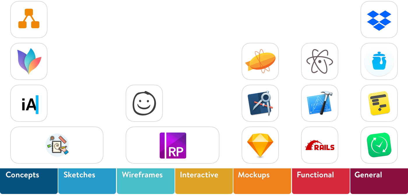
I want to try something different. I want to help you judge what could work for you and how, by sharing what works for me and how. I will organize things into the prototyping phases that I typically follow.

  1. Concepts
  2. Sketches
  3. Wireframes
  4. Interactive
  5. Mockups
  6. Functional
  7. General

1. Concepts

Capture, formalize, interrogate and connect ideas into coherent wholes. It is important to tell yourself the story first before telling others.

Tools

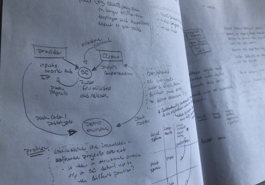
  1. Pencil and Paper
  2. iA Writer
  3. MindNode
  4. Draw.io

Pencil and Paper

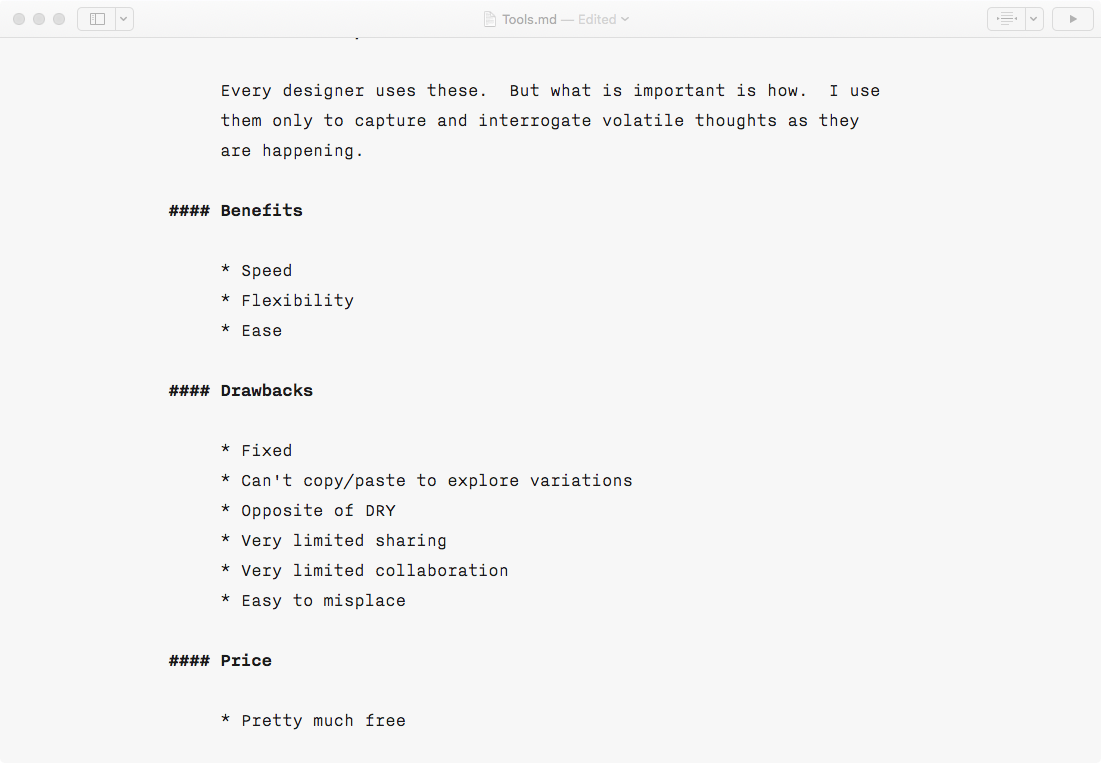
Every designer uses these. But what is important is how. I use them only to capture and interrogate volatile thoughts as they are happening.

Benefits

  • Speed
  • Flexibility
  • Ease

Drawbacks

  • Fixed
  • Can’t copy/paste to explore variations
  • Opposite of DRY
  • Very limited sharing
  • Very limited collaboration
  • Easy to misplace

Price

  • Pretty much free

iA Writer
Markdown Editor

iA Writer is a powerful and polished markdown text editor. It is all about focus. First, markdown itself frees you from formatting trivia. And second this app offers a distraction-free UI. Like a blank page, it has almost no UI at all.

My goal with iA Writer is to start formalizing vision, strategies, problems, solutions, thoughts. I do this first for myself and later to share with others. It won’t be perfect. It shouldn’t be perfect. The concepts only need to be sufficiently formalized to support the weight of subsequent phases.

Benefits

  • Visually minimal
  • Markdown based editor
  • Focused
  • Integrated blog publishing to Medium and WordPress

Drawbacks

  • Markdown is Non visual, and some ideas at this stage can be hard to express textually
  • As text, markdown requires reading
  • iA Writer is very expensive for what it does
  • iA Writer is in a market crowded with other solutions that may suit you better

Price

  • $30. I find this very expensive compared to other markdown editors, and there are many good ones that are free. But I like it. So I paid.

Alternatives I have Used:

  • MacDown, Quiver, Evernote, OneNote, SimpleNote, Notability, TextEdit, Notes, Contour, Scrivener, etc…
Mindnode
Mind Mapping

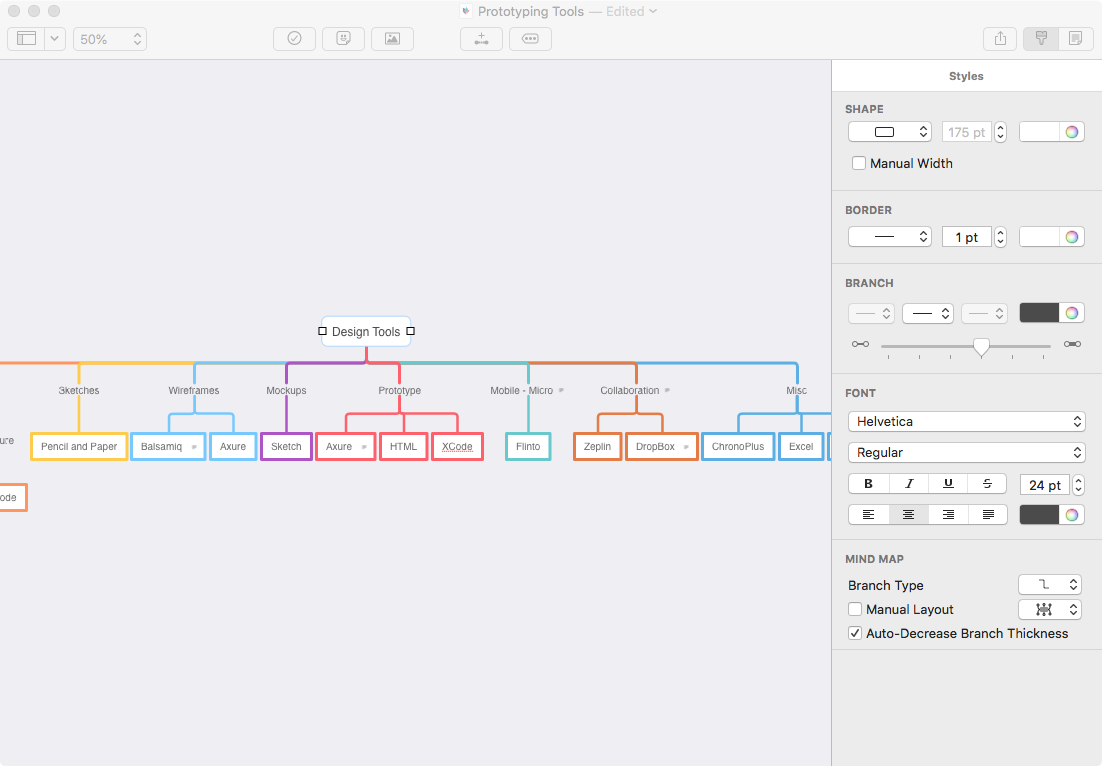
Mindnode is a minimalist mind mapping application. It provides just enough features to structure your thinking and stays out of the way so you can focus on content.

My goal in mind mapping is to structure things and their logical relations. These could be screens, concepts, goals, component states, actions, almost anything. At first I just want to inventory the “stuff.” After establishing a basic inventory I want to discover and model the inherent patterns, affinities and gaps in the “stuff”.

Benefits

  • Simple UI
  • Simple to use
  • Limited features help keep me focused on substance

Drawbacks:

  • Mac only
  • Does not support connecting branches back together into downstream nodes
  • Collaboration options are limited to sending exported files

Price

  • $40. This is a good price for a mind mapping of this quality.

Alternatives I have Used:

  • Xmind. More complex and more expensive than MindNode. It is fully cross platform (Windows, Mac, Linux, Mobile) and provides a helpful Gantt chart view of your map. This view allows Xmind to bridge across conceptualization and project management better than MindNode.
Draw.io – Identify and Model Actions

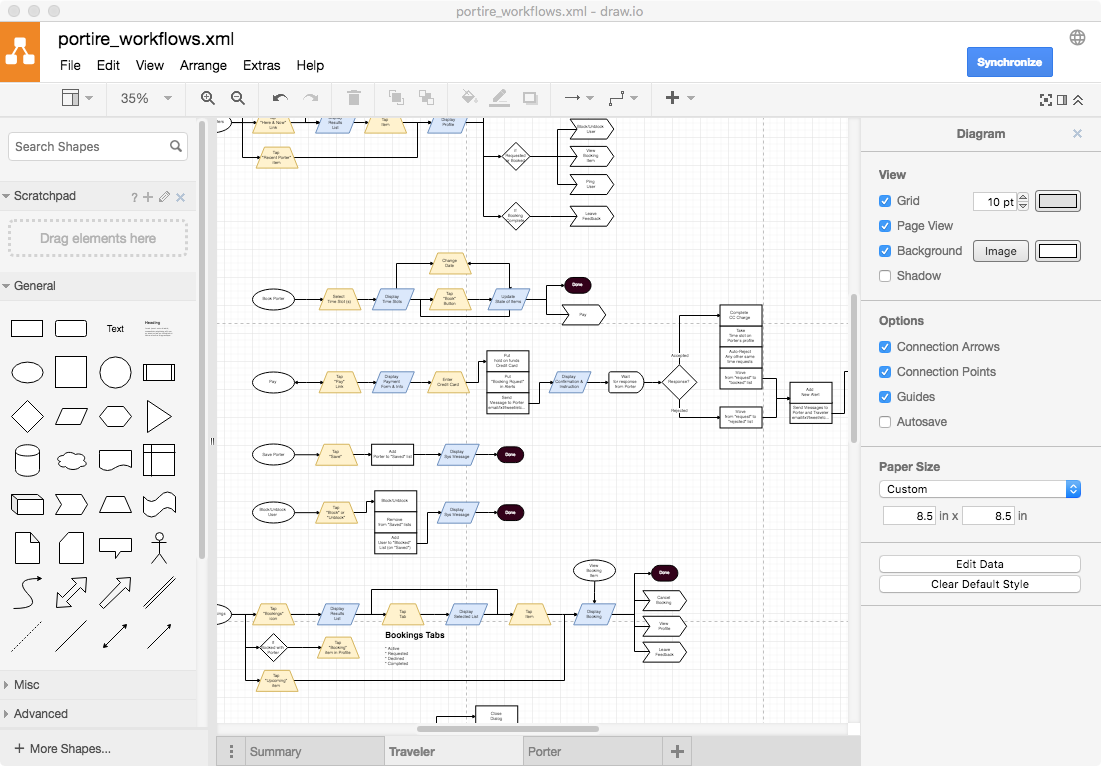
Draw.io is a free browser-base flowchart tool. It is sufficiently featured UX design. I usually avoid browser based design tools. They aren’t responsive enough and I like owning control of my core tools. But in this case, free wins.

My goal in flowcharting is to model user and system actions. I do this by identifying the user’s tactical goals and constructing the sequences of necessary cause-and-effect steps to achieve them. This is the heart of UX design, and I spend a lot of effort keeping screen designs and flows in sync.

Benefits

  • Simple enough
  • Free
  • Easy collaboration

Drawbacks

  • It isn’t optimized for design, so it has a lot of features that we don’t typically need
  • For complex diagrams connection lines require a lot of manual intervention
  • I would prefer an infinite canvas over tiled pages

Price

  • Free

Alternatives I Have Used

  • LucidChart. Nearly identical in most ways. Except it seems to have more features (which complicates usage) and costs.
  • OmniGraffle. A very mature solution. However it is much more expensive and like nearly all of Omni’s UIs, it is needlessly clumsy and convoluted. I dislike every Omni UI that I have used.
 

My UI Prototyping Toolkit (2 of 7)

2. Sketches

Define basic notions of layout, structure and use case flow.

Tools

  1. Pencil and Paper

Pencil and Paper

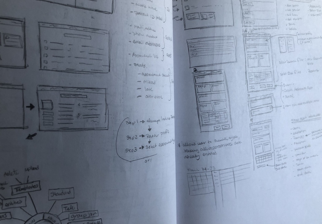
Again, paper is a great tool for capturing fleeting ideas. Here the ideas are more concrete, and I’m trying to make spatial rather than conceptual sense of things. I keep my sketches small. This prevents detail distraction, and help me see a broader scope at a time.

It is the right tool for this job. But move on quickly. Gold plating paper sketches is a waste of effort.

Benefits

  • Speed
  • Flexibility
  • Ease

Drawbacks

  • No copy/paste. This makes exploring many minor variations a lot of work.
  • Edits are messy. Lots of erasing and scratching can obscure your work.
  • There is no re-use. Every elements must be created from scratch every time you use it.
  • Non collaborative. Unless your collaborators are sitting right Next to you. At the same table.
  • Static. Paper helps easily identify things and some crude spatial and syntagmatic relationships.

Price

  • Pretty much free

Alternatives I have Used

  • I find that I am using Balsamiq more as an alternative to paper.


My UI Prototyping Toolkit (3 of 7)

3. Wireframes

I use wireframes to explore concrete representations of the structures and workflows defined in the previous stages, select the most promising direction, and produce a relatively complete detailed schematics of layout and flow for mockup.

I will often make wireframes interactive rather than wait for mockups. The choreography of elements is increasingly as important to prototype as their layout and deserves that same staged and iterative design approach.

Tools

  1. Balsamiq

Balsamiq
Define Basic Elements and Layouts

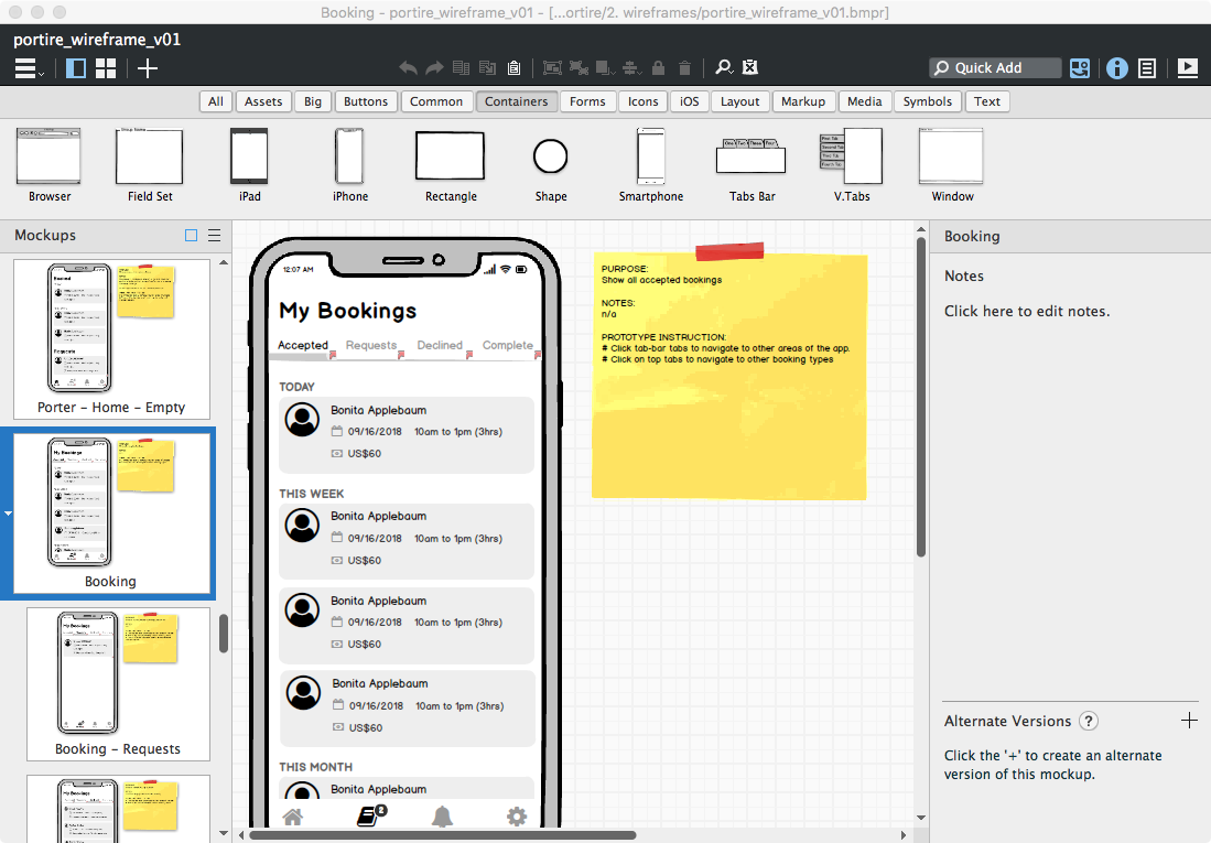
Balsamiq is a very fast and crude screen layout tool that combine the benefits of paper and digital while mitigating the drawbacks of each. And like paper, do not gold plate our work. Do it and move one. Quickly.

Balsamiq provides drag and drop palettes of common UI elements, the ability to create custom symbols with overrides, and allows forking pages into multiple variations. It can also export clickable PDFs for sharing.

I use Balsamiq to explore many variations quickly and cheaply, evaluate them, converge on the most promising design directions and move on to higher fidelity as soon as possible. My focus is on fluidity, not completeness, accuracy or precision.

Benefits

  • Easy
  • Focused
  • Fast
  • Symbols and overrides help keep things DRY
  • DRY helps rapid iteration and forking variations
  • Clickable PDF make the

Drawbacks

  • Ugly (which is actually functional)
  • Exploring screen states required a full screen copy for each state. This complicates iteration because the same edits need to be replaced across multiple screens, making iteration painful
  • Screens are static. But with mobile, state transitions are critical to help keep users oriented
  • The library of symbols is aging. When was the last time you actually used coverflow?
  • Cannot scroll. Long pages, which are common in mobile, require hacks and kluges.

Price

  • $89 which is good value for what it does. There is also a subscription version starting at $9 a month for 2 project (which is a fantastic deal).

Alternatives I Have Used

  • Paper. I’m using paper less in favour of Balsamiq.
  • Axure. It is possible to use Axure for static wireframes, but it is a little heavy handed for that.


My UI Prototyping Toolkit (4 of 7)

4. Interactive

This stage is about choreographing behaviour, workflows, conditionals. Its about seeing realistic behaviour and responsiveness to user actions. These need to be prototyped as much as layout and visual design.

Axure
Complex Interactive HTML Prototypes

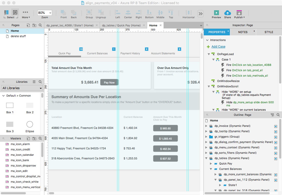
Axure visual layout tool that produces HTML JS prototypes without the need to code. However, understanding Javascript is critical to producing sophisticated prototypes. It is extremely powerful. But it is also extremely obtuse. Its like the Hulk of UX tools. A grey and aging Hulk.

Axure follow a basic WYSIWYG approach to layouts. Every object can be made interactive, and you can attach some fairly complex logic. You can, with enough patience and cleverness, make an Axure prototype do almost anything.

Axure can produce very high fidelity prototypes. However I prefer to use it at the wireframes stage. It is an intensely inefficient tool, whose inefficiencies blossom as your prototype grows. Striving to pixel perfection is just too frustrating.

I mostly dislike Axure. But it remains in my toolbox because I know it well and few other tools can deliver similar results. If Axure 9 doesn’t improve remarkably Framer might replace it.

Let’s give credit where due. Axure prototypes are truly interactive. They are not just clickable slideshows. And because it produces locally running HTML JS is it universally sharable and presentable. Furthermore Axure can auto generate full spec documents. This is perhaps more useful in Enterprise or highly regulated environments, and tools like Zeplin or Avocode are much better than a dense spec doc.

Benefits

  • Very powerful
  • HTML JS based
  • True interactivity and responsiveness
  • Good for brochureware or basic e-commerce site prototypes
  • Can do mobile or web, plus responsive layouts
  • Fast and easy to get something started

Drawbacks

There are too many to list. But most boil down to:

  • A jurassic UI that still feels like it an engineering proof of concept.
  • Rabbit warrens of popups and mosaics of doodads necessary to accomplish even menial tasks.
  • The constant need for obtuse hacks and oblique witchcraft to accomplish seemingly simple things — “workaround” and “no” are the two most common words you will see in forums.
  • Source files that rapidly spiral out of control into a spaghetti piles of instructions, counter-instructions, hacks and bandaids.
  • Debugging the mess often becomes impractical making it faster and easier to just nuke everything and start from nothing than try to fix what’s there. With instructions assigned to events assigned to screen objects that could be almost anywhere, it can be nearly impossible to trace where an offending behaviour is coming from.
  • Browser performance absolutely sucks. The single page app is a common software design paradigm. But the weight of all the code on a single page grinds animation and transition performance to a crawl.
  • I could go on for pages, but you get the idea.

PRICE

*$29/month subscription, or $495 outright. I purchased it outright and upgrade with each new version.

Alternatives I have Used

  • FramerJS. Code based. That may scare some designers. But debugging an Axure prototype is far far scarier
  • Xcode. Yes, more code. But really, the amount of time debugging and reacting takes with Axure, I can produce the same mobile prototype in Xcode — and get native performance.


My Prototyping Toolkit (5 of 7)

5. Mockups

Pixel perfect screen designs that are the scale models showing exactly how the finished product should look and flow. They also provide the material from which we can pull the visual design specs engineering needs.

Tools

  1. Sketch
  2. Flinto
  3. Zeplin

Sketch
Pixel Perfection

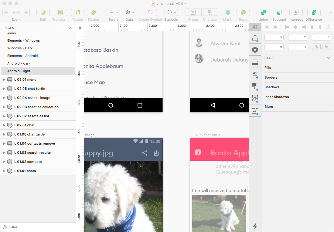
You all know Sketch. Most of you use it. I used to use Illustrator. I did not hate it. But it clearly was not a UI design tool. Sketch is. Pixel based. Data integration. Batch export features. Basic clickable interactive prototyping. And its system of symbols and overrides that keep my work truly DRY (Don’t Repeat Yourself). Its not perfect, but its getting pretty close.

I started with CorelDraw, Flash and Illustrator. I switched to Sketch shortly after leaving my PC for a Mac years ago. For a while it was the only serious alternative to misusing Adobe products. Recently many direct competitors to Sketch have sprouted up. This is fantastic.

Benefits

  • A layout tool optimized specifically for screen design
  • The developers are constantly releasing improvements
  • Lots of 3rd part plugins to extend value
  • Symbols and overrides help keep things DRY
  • Real data integration
  • Sketch Cloud makes showing easy, plus supports basic interactivity (so long InVision!)

Drawbacks

  • The symbol overrides list can become a hard to scan mess creating friction.
  • Mac only

PRICE

  • $99 per year. That’s a steal of a deal for this chef’s knife of a tool.

Alternatives I Have Used

  • Illustrator. Vectors have always been better for UI work. Plus, symbols! Still viable solution. No excuse for using PS.
  • CorelDraw. Vectors before I switched to Mac. Still has unique helpful features unheard of on other apps, like making piece slides of any arc from a circle with a click and drag.

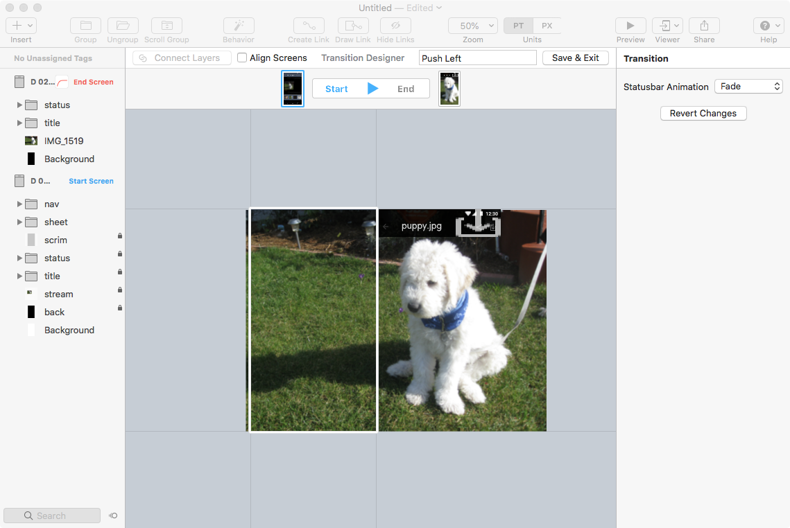
Flinto
Animated Transitions

Flinto imports a Sketch source file. You define start and end states for selected dartboards, and with a few selections you have a satisfying animated transition. It is easy in theory but I always find its easy to get confused switching between states and managing elements transition.

I use Flinto rarely. Most of my focus in a larger scale flow, less on micro interactions and animation. But when it is necessary to communicate these to developers a Flinto demo is far more effective than static screens and narrative.

Benefits

  • Very similar UX to Sketch
  • Define state is easier and faster than managing a timeline
  • Active developers

Drawbacks

Focused on very narrow aspects of design
Easy to forget which state you are working on

Price

  • $99 which include all updates for one year.

Alternatives I Have Used

  • Principal. Timeline based. I found it more complicated.
  • Flash. Yes folks, Flash has always been able to solve the same problem, just in a worse way.

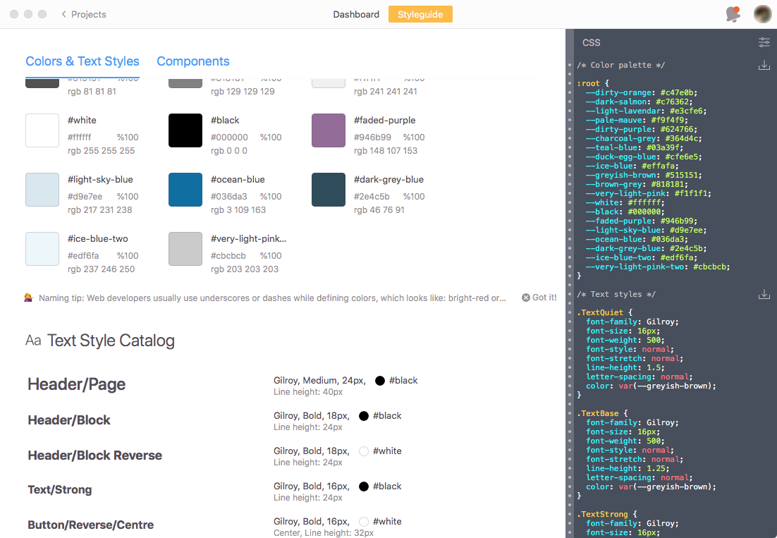
Zeplin Screen


Zeplin
Screens and Specs

With a keystroke Zeplin takes your Sketch, PS, XD or Figma source file and produces a complete set of screens and interactive style guide and shares them with your team.

My goal in using Zeplin is to never write another visual spec document again.

Benefits

  • Clean and simple UI
  • Easy to understand
  • An increasing list of integrations with other tools like Slack and Jira
  • Syncs engineers perfectly with the latest designs

Drawbacks

  • Renaming artboards in Sketch de-syncs them with the screens in Zeplin.
  • Expensive compared to other subscription services.
  • Sketch Cloud already does a lot of what Zeplin does.

Price

  • There is a free account, but you will quickly outgrow that
  • $19/month for 3 active projects — supposed unlimited inactive projects.

Alternatives I Have Used

  • Avocode. I preferred Zeplin’s UI.
  • Sketch Cloud. Does some of what Zeplin offers, but not enough yet.


My Prototyping Toolkit (6 of 7)

6. Functional Prototypes

Functional prototypes actually work. They also blur the lines between prototyping and engineering. But sometimes they are necessary to either fully demonstrate a vision. And sometimes its almost faster to build something real then something fake.

Tools

  1. Ruby on Rails
  2. Xcode
  3. Atom

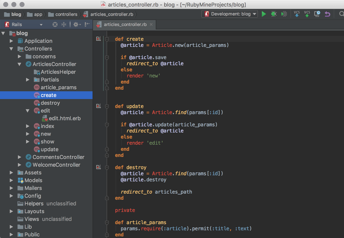
Ruby on Rails
For the Web

RoR is a venerable web development framework. I still use it to rapidly prototype fully functional, db-driven, web-based application designs. Its fast. Its DRY. Within an hour I can have a very basic commerce site built and deployed.

The learning curve is steep. You need to know Ruby and understand the model-view-controller paradigm. You will have to use the CLI a lot. You should understand relational databases. And hand crafting HTML and CSS will often be helpful.

There may be better frameworks for prototyping. And working with JS will be more transferable. But, I use RoR because we have a history together, and it does what I need.

Benefits

  • Your prototype is real and truly interactive
  • You can use real data
  • You can focus on behaviour and workflow and let the framework worry about layout

Drawbacks

  • Steep learning curve
  • Code (benefit for some, drawback for others)
  • Relies on a web of integrated technologies that you will have to learn
  • Ruby is not a common language so it it not very transferable
  • It is getting old now, there are newer and more popular frameworks

Price

  • Free

Alternatives I have Used

  • ColdFusion. Eons ago.

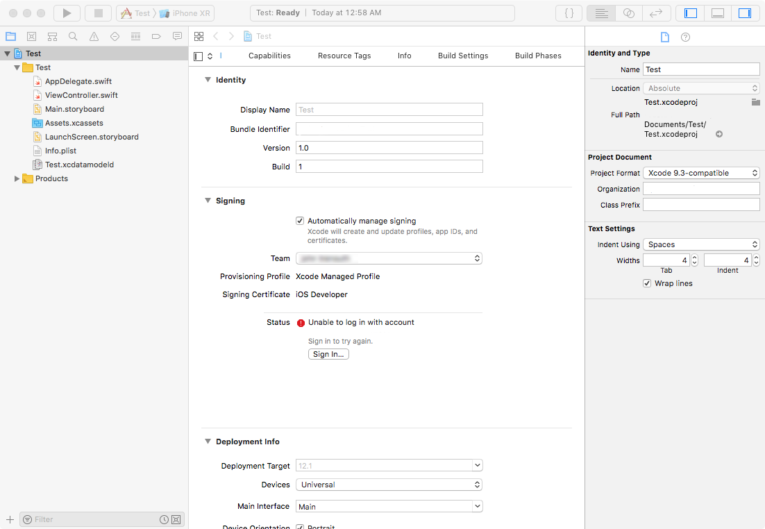
Xcode screen

XCode
Integrated Development Environment

Apple’s industrial strength development environment. I use it to produce highly realistic iOS prototypes, without relying on hacks or fakes. In many cases I can do it faster and with less frustration than with Axure. Learning Swift is a prerequisite. Checkout Stanford’s free software engineering classes on Swift.

To be honest my Swift-fu is weak. I am limited to using standard iOS controls rather than playing with novel navigation methods or clever animated transitions. Still, sometimes testing with a real app, that really works, on a real phone is worth it.

If you don’t mind working in Code and thinking like an software engineer, XCode can be an exceptional prototyping tool.

Benefits

  • Very powerful
  • Truly interactive prototypes
  • Make real app using Apple’s controls

Drawbacks

  • Steep learning curve, for the tool, for the language and the APIs
  • Code (benefit for some, drawback for others)
  • From a design perspective, InterfaceBuilder behaves in weird and unexpected ways
  • I haven’t found a CSS-like anything for formatting, which makes it a lot of error-prone manual work to keep all the font styles consistent for example.
  • Hard to demo to non-Apple users

Price

  • Free

Alternatives I have Used

  • None

Atom
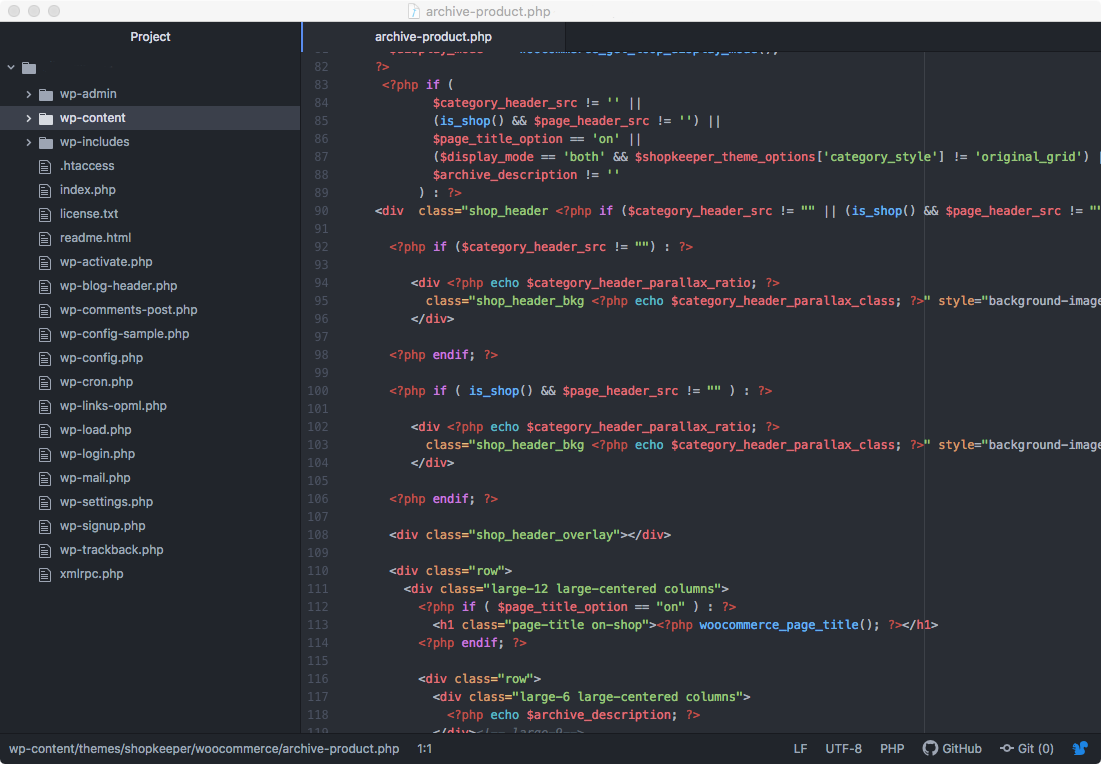
Code Editor

When I need to dig directly into code I use Atom. I used to use TextMate. As a designer the finer points of editor preference that erupts into developer holy wars is lost on me. Atom looks a little nicer to me.

Benefit

  • Give my usage I notice little difference with other text editors

Drawbacks

  • None

Price

  • Free

Alternatives I have Used

  • Textmate, Brackets


My Prototyping Toolkit (7 of 7)

7. General Tools

Chrono Plus
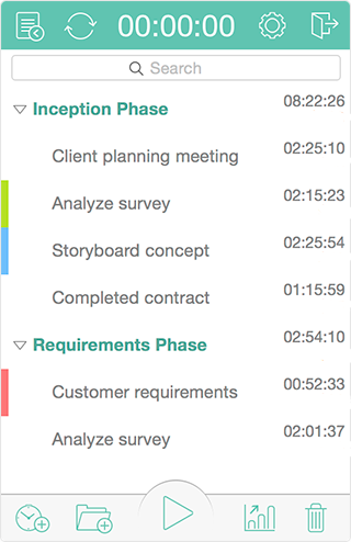
Time Tracking

A basic but visually attractive task bar timer for Mac. It allows you to create multiple tasks within multiple projects. Stop guessing and just track everything. You may be surprised by where you time goes.

There are lots of competing products. Many require a subscription and cloud integration. I avoid these. Its just a timer.

Omni Plan
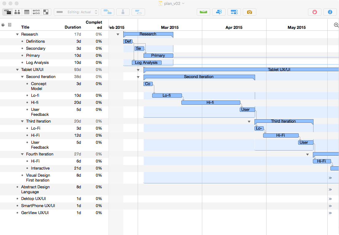
Project Planning

Gantt charts present tasks in sequence over time, including resources and dependencies. I find it helpful to see these expressed visually. OmniPlan is, however, a little expensive and over powered for my needs.

For alternatives I have used Microsoft Project, XMind and Xplan. I don’t like any of these tools. Omni Plan seems like the least bad.

Icon Jar
Icon Set Manager

Organizes your icon sets, allowing drag and drop into nearly any installed design software. Icons can be tagged for searching. With thousands of icons across multiples set, this tool is critical for finding needles in haystacks.

I don’t know of any competing products.

Pixelmator

I occasionally need to touch up a photo. I expunged Adobe from my life years ago. So I use Pixelmator. Its seem adequate. Sadly, Photoshop has so defined how I conceive of editing images that I am constantly frustrated when Pixelmator doesn’t just act like Photoshop. Grrr. That’s too bad for me. Adobe has been banished.

Photoshop is the obvious alternative. I haven’t used Affinity.

GitHub Desktop

I’m ok with a CLI. But version control can go sideway really easily. So I prefer to see the features and the family tree.

There are lots of Git GUIs. This is one of the cheapest and easiest to use.


Dropbox Screen

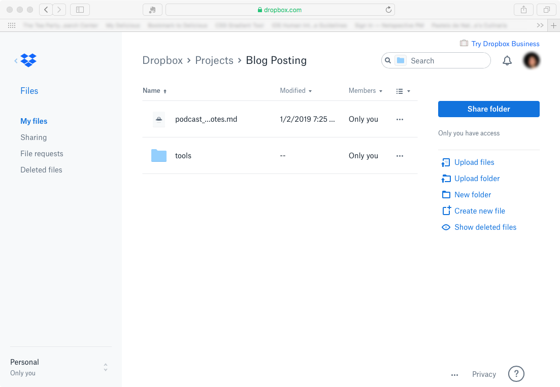
Dropbox

Cloud sync is ubiquitous. Box seemed to provide richer files management, sharing and meta features than Dropbox, and for about the same price. Dropbox is fine. But I prefer Box.

Lots of competitors. So far I have used (in order of preference) Box, Dropbox, OneDrive, Sync, Google Drive, and iCloud.

Sketchup

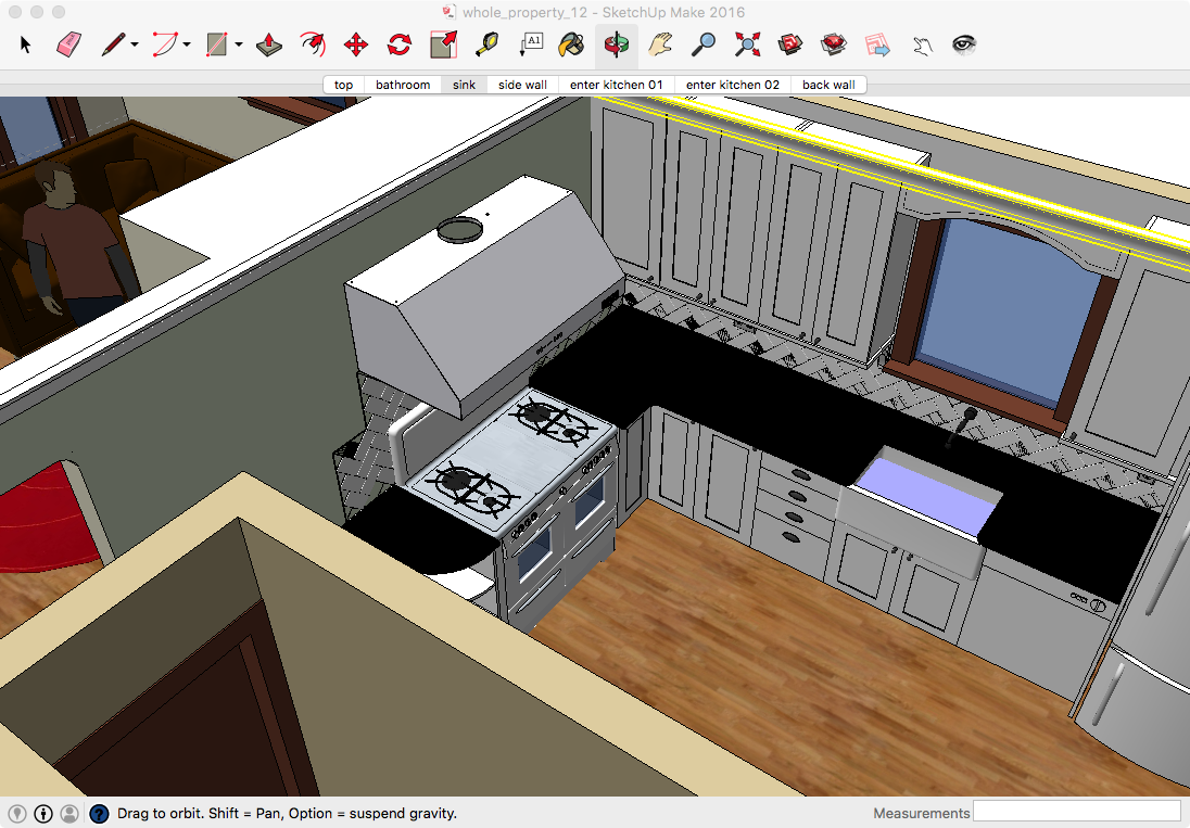
Ok, its not for UX or UI design. But it is still for design. And I love using SketchUp. I even built a model of my antique oven.

When Design Blogs Go Stale

It has been about 2 years since I’ve posted anything here.  There are a couple of reasons.  The first is that I found I really did have much that was worth saying, so there was little motivation to keep saying.

I notice that I also haven’t really used my Bloglines account much in the past couple of years either.  This seems to be because not only did I have nothing worth saying about design, no one else seems to either.  And by degrees I stopped reading my feeds altogether.

And the second reason is that I found after leaving my corporate job to run my own consultancy I simply didn’t have the time or energy anymore.  I wonder how many blogs out there are really just the result of corporate inefficiency .

Anyway a recent project has shown me that I may perhaps have something worth saying again.  It will be a lot more technical in nature, but I notice that I’ve still got a few drafts on the shelf I’ll probably dust off and serve up as is just to help get these rusty gears in motion again.

Telnet 2.0 — For the People!

Using IM (instant messaging) to access application isn’t exactly new anymore.  Imified is a good a example.  But really, only geeks develop this, only geeks use this, and only geeks get excited by this. 

Remotely controlling applications by sending text messages through IM is essentially just a new protocol for telnet.

What is interesting is how this very old technology with a new face is slowly percolating from the geek world into the consumer world.  For instance, with Kwiry you send a quick message to control your Tivo.  Or, let’s say you remember a movie you want to see, by reading about it in a paper, seeing a billboard or even eavesdropping on a conversation, just text the name to your Netflix account and it will be on its way to your house.

What’s so great about this?  Couldn’t I just navigate to to the mobile version of Netflix to queue up that movie?  Well, what’s great is 1) so many people are already texting each other, texting is already a common behaviour while surfing the web on a tiny screen likely never will be, and 2) there is no navigating, no wasting time clicking on this or that widget to find the functionality you need — just text a name or a couple words — the end.

Welcome to telnet 2.0 (please note a bit of sarcasm here).

Follow up on Gladwell and Other Aspostles


Wow.  I thought I didn’t care for Gladwell’s brand of slick packaged pop-intellectualism.  It looks like The Register has even less patience than I.

Gladwell has made a career out of handing simple, vacuous truths to people and dressing them up with flowery language and an impressionistic take on the scientific method. Hive minders seem to love this garbage for obvious reasons. 01/20/2007

And

For some reason, Gladwell is paid tens of thousands of dollars for flimsy stories about companies taking “unique” approaches to solving problems when they aren’t actually doing anything of the sort. In his corporate pep-talks, Gladwell describes a utopian vision that can never be realized, while doling out pithy gems such as, “ability plus experience equals expertise.” 10/09/2005

And lastly

“…In embracing the diversity of human beings we will find the true way to human happiness.”  So there you’ve got Gladwell in essence: he always ends with a Hallmark style greeting telling you something sweet, bland and uplifting – that you already knew.
11/30/2008

All very ouchy, and peharps even a little bitchy.  For a more sober, but equally critical perspective on not only Gladwell, but his self-styled economic prophet brethern Surowiecki and Anderson, check out this Gawker piece:

And that fact gets at the heart, I think, of why people are turning against the svengalis of new marketing. They’ve all become hugely famous and sought-after on the 5-figure lecture circuit by penning ephemeral “bibles” about the next big thing, proving only that they themselves were it. Can you really blame skeptics in a time of scarcity for denying them the ability to have their cake and pop out of it, too?

My point here is to wonder if we actually are beginning to demand more and these journalists simply cannot bear the scrutiny, if we are not letting crap win?  Or is this like Soviet communism, where these guys are just getting crushed under the stress of thier bullshit?